
Do you remember when all you could do on your phone was make phone calls?
It wasn’t so very long ago. Phones were for phone calls and websites were for computers.
Then along came the iPhone, the iPad, the Android phone, and a whole slew of other phones and devices.
It’s gotten to the point where most website traffic comes from mobile devices.
The number of different screen sizes is amazing! So how do we make sure your site works well on any size screen?
Well, there’s a trick. It’s called “responsive design”.
Basically, that means the website will “respond” to the size and shape of the screen it’s being viewed on.
We use HTML tricks to make the images scale on the fly. Three column format pages on your desktop become one column on your phone. Maybe two columns on your iPad!
On your computer screen, the menu is big and easy to see. On your phone, it becomes a drop-down list.
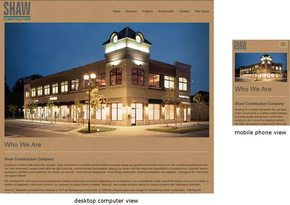
responsive website example
If your website isn’t mobile-friendly, you’re losing money.
When people hit your site and they can’t read it or use it, they won’t call and complain. They’ll just hit the back button and go to your competitor’s website. They’ll get the money and you won’t even know you missed out.
At Cool Web Tech, we recognize that being mobile-friendly is critical to the success of your business.
If you would like to see what we can do for you and your business, why not click here and contact us now?